Some people know that I’m not fond of the category “women’s fiction,” at least partly because I don’t know what it means. Although I do belong to the Women’s Fiction Writers Association, I’m not convinced I’m a women’s fiction writer. I am female and I do write fiction, but I’d say it was mainstream.
I’ve had a difficult time tracking down novels in that category, or at least novels that aren’t also part of another genre, most commonly a historical novel or a romance. Yesterday I posted a query in a forum on WFWA asking for examples of “women’s movies.” Andrea J. Wegner who has a most interesting looking website, Write with Personality, suggested that women’s fiction is a marketing gimmick to target mainstream fiction to women. Her contention was that the main difference between regular old mainstream fiction and women’s fiction was in the books’ covers.

This is an interesting idea and worth a few posts. My first thought, though, was to wonder if any of my manuscripts were to be published, what would the covers look like? What three representative items might be on the cover? Picking out representations of your story is an interesting and fun hypothetical exercise for any yet-to-be-published manuscript.
Here’s my thoughts on some of my manuscripts, which are in various stages of doneness.
Man in the Middle:
An old Miss Havisham-type exterior of a house, large and looming with three stories and peeling paint. A cluster of women, including a gaunt, gray-haired woman, a grandmotherly woman with white hair, two or three tall, dark-haired women, a plump blonde teenager and a cross loooking redhead. Somewhere there would have to be the outline of a man who is an above the knee amputee.

Alternate: the same man, fly tying equipment, possibly with a strand of the redhead’s hair caught in his vice. Those three images could be contained in the outline of the same house.
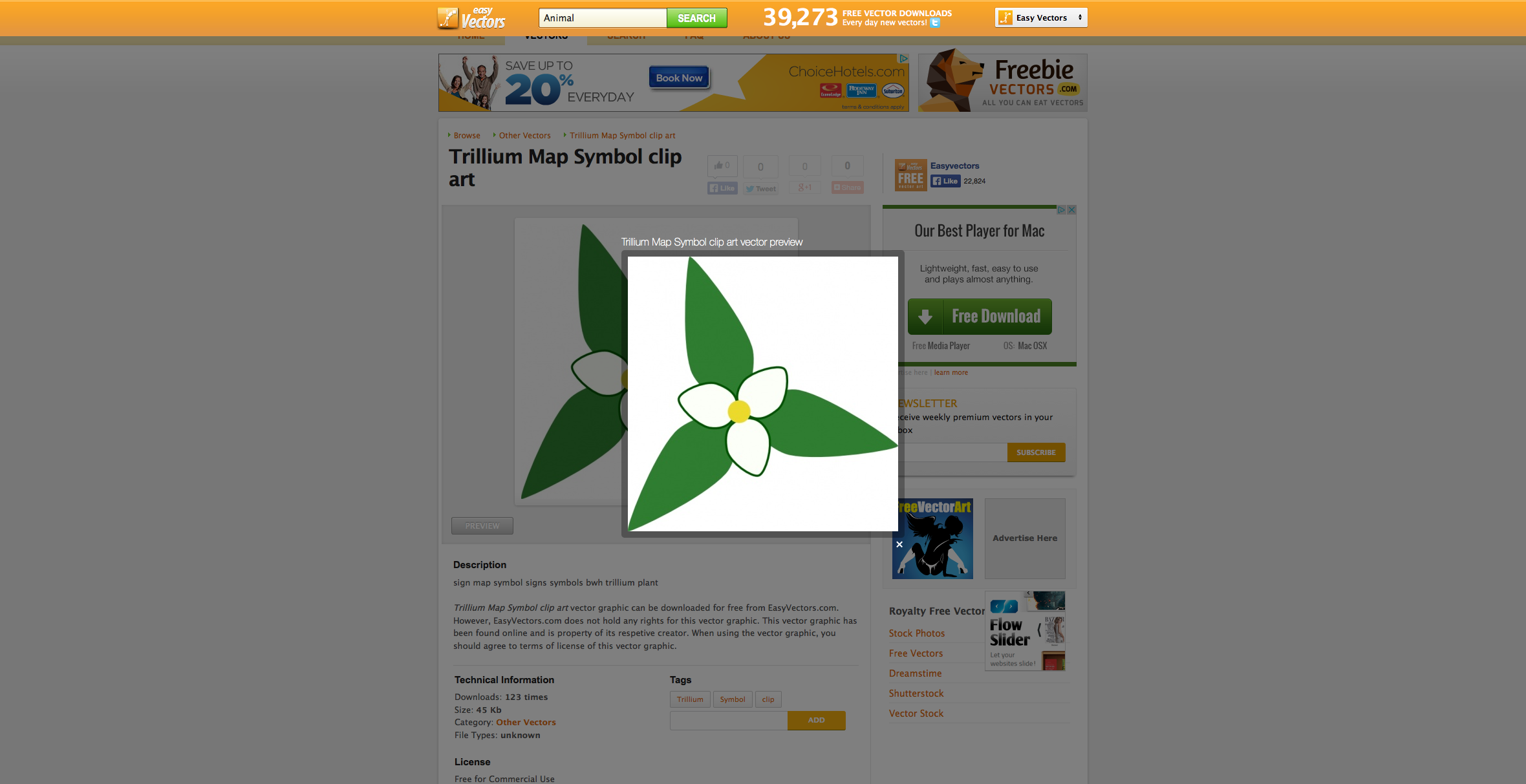
Trillium:
The obvious image here would be a representation of said flower, maybe with a dollhouse, a whiskey bottle and spilled glass, and a station wagon from the 60s, somehow drawn on each of a petal or at the tip of a petal. At each of the leaves there could be the representation of a woman—an older matronly woman, a middle aged but attractive woman, and a younger but harried looking woman. At the center would be a bald man.
Alternate image: A Hawaiian shirt, a circuit board, a cabin in the woods with a Wired Hair Pointing Griffin in the doorway.

Cuisine of Loneliness: A spilled box of fettuccine. Or maybe the title could be made out of pasta.

Three dark haired men grouped in one corner. One a chef, another a doctor, the third that same amputee, but older. A balding red-haired man in the opposite corner with a dark haired woman with two Irish Water Spaniels in the middle.

Alternate: A chef’s toque with a rolling pin flattening it, smashed china, and the skyline of Las Vegas in the background.,
The Lack: A wiry blond man sitting on the steps of a large Eastern house with a young girl on the porch next to him, a tall, dark-haired man with a small boy in front of a smaller house with boarded up front windows, a road running between the two and a woman in the middle, possibly with the roadway wrapped around her in a knot.
Alternate: A pistol, a tipped over coffee cup with only a drop of coffee left, a half-made wooden bow.

Do any of these conceptual covers appeal to you more than others? How would you represent your own novels in progress?

#1 by cryptictown on June 1, 2014 - 5:19 pm
What a fun post! Well, mine would all have dark covers, but aside from that, I’d have to think about it.
#2 by Dawne Webber on June 1, 2014 - 5:25 pm
I write women’s fiction and it took a while for me to figure out exactly what that was. I read an article that said Ann Patchett and Jennifer Egan wrote in that genre. And Jodi Piccoult and Audrey Niffenegger. Even though each author is quite unique, reading them gave me a better feel for the genre.
I think covers do cater to genre. If you check out Beautiful Ruins by Jess Walter, the cover proclaims women’s fiction written by a woman. Wrong on both counts. I wonder what that did to sales.
#3 by c2london on June 2, 2014 - 10:03 am
Hi Dawn. I agree, the cover does hint at women’s fiction. You think that was a ploy to attract women readers? Now I’m intrigued by the book and may have to read it. Although I’ve often painted seaside villages, the cover would have turned me off.
#4 by coldhandboyack on June 1, 2014 - 5:48 pm
I develop the cover ideas as I’m writing. They usually depict a scene and the genre.